7 Video Games with the Most Unappealing Designs
Video games can be visual masterpieces, pulling players into vibrant worlds with stunning art. But not every game nails the look, and some are downright hard on the eyes, despite their gameplay or story.
I’ve dug into the archives of gaming history to spotlight seven titles that stand out for their less-than-stellar designs. These games, ranging from early 3D experiments to modern missteps, prove that looks aren’t everything in gaming.
7. Dwarf Fortress (2006)
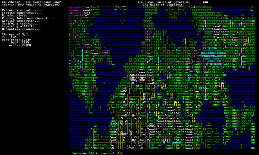
‘Dwarf Fortress’ is a cult classic with unmatched depth, letting players build sprawling underground colonies. Its complexity is legendary, but its visuals? Not so much. The game leans on ASCII text and basic tiles, resembling a chaotic spreadsheet more than a polished title. Even with fan-made graphic packs, it’s tough to call this one pretty.
The charm lies in its raw functionality, not eye candy. For every fortress I’ve built, I’ve squinted at jumbled symbols and crude maps. Yet, the game’s addictive depth keeps players hooked despite its bare-bones aesthetic.
6. Friday the 13th: The Game (2017)
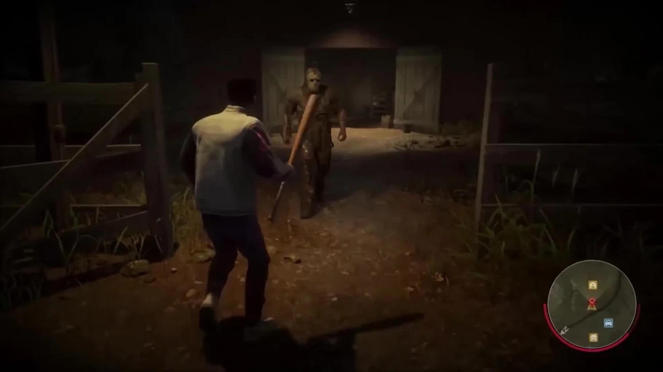
‘Friday the 13th: The Game’ aimed to capture the slasher film’s gritty vibe, letting players control Jason or camp counselors. Its visuals, though, feel like a step back, with clunky character models and bland environments that lack polish. Textures often look muddy, and animations can feel stiff.
Horror fans like me enjoy the tense gameplay, but the dated graphics make every chase feel like a low-budget throwback. It’s fun, yet I can’t help but wish the eerie camps looked as sharp as the scares.
5. Dr. Jekyll and Mr. Hyde (1988)

This NES game, based on the classic novel, is infamous for its baffling design choices. ‘Dr. Jekyll and Mr. Hyde’ features murky sprites and confusing backgrounds that make it hard to tell what’s happening. The art feels like a fever dream, with enemies blending into the scenery.
Playing it, I felt lost in a haze of pixelated chaos. The game’s poor visuals amplify its frustrating mechanics, earning it a spot as a go-to example of how not to design a game.
4. Sonic the Hedgehog (2006)
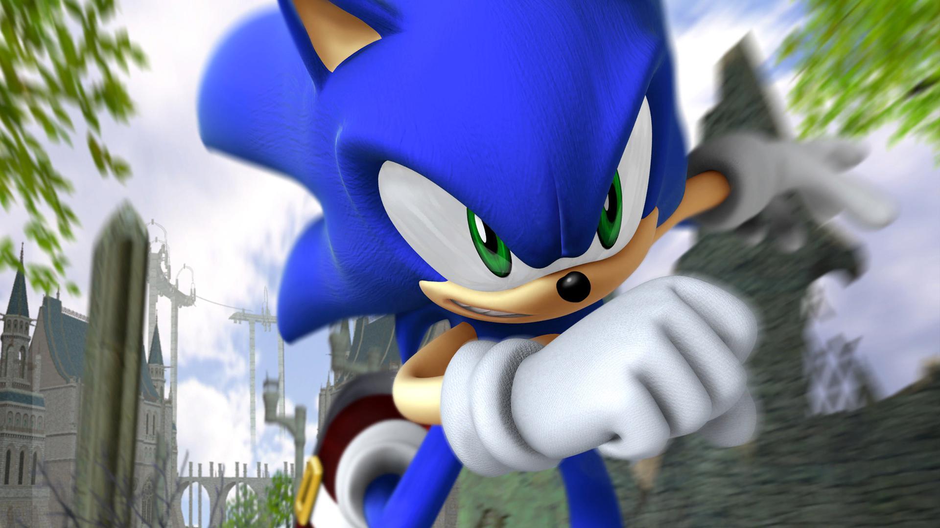
Known as ‘Sonic ‘06,’ this title was meant to reboot the speedy hedgehog’s adventures. Instead, it delivered glitchy, uninspired visuals. Character models look awkward, with uncanny faces, and environments feel empty or rushed, despite the game’s ambitious scope.
I wanted to love this one, but the jarring textures and wonky animations made every level a visual slog. It’s a reminder that even beloved franchises can stumble when design takes a backseat.
3. Lula 3D (2005)
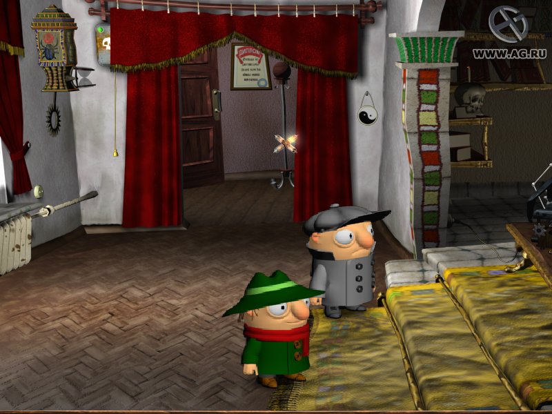
‘Lula 3D’ tried to be a bold adult adventure game but fell flat with its visuals. The graphics are low-quality, with stiff animations, recycled character models, and a choppy frame rate that make the world feel lifeless. It’s a visual mess that doesn’t match its ambitious tone.
I found the environments dull and the character designs laughably outdated. The game’s attempt at edgy humor is overshadowed by its clunky look, making it a forgettable experience.
2. E.T. the Extra-Terrestrial (1982)
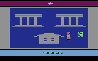
The Atari 2600 game ‘E.T. the Extra-Terrestrial’ is a notorious flop, rushed to market in just five weeks. Its visuals are painfully basic, with blocky sprites and repetitive backgrounds that fail to capture the magic of the film (1982). The game’s design feels like a rushed sketch.
Playing it feels like staring at a pixelated void. Its ugly aesthetic and clunky gameplay contributed to Atari’s downfall, marking it as a historic misstep in gaming.
1. The Legend of Zelda: Link’s Awakening (2019)
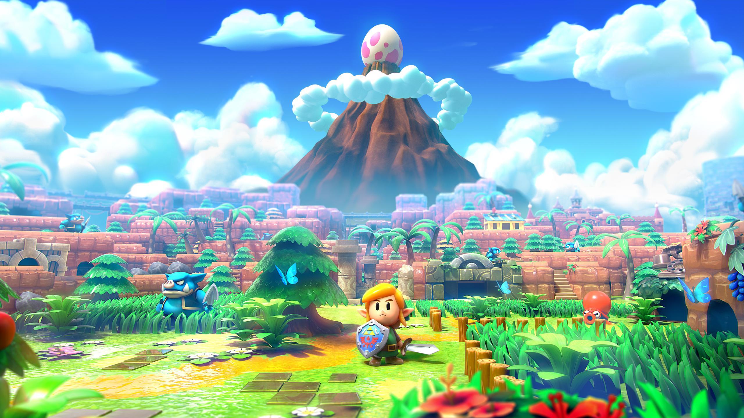
The Nintendo Switch remake of ‘The Legend of Zelda: Link’s Awakening’ aimed for a toy-like aesthetic, but its plastic, diorama-style visuals feel oddly out of place. Compared to the lush world of ‘Breath of the Wild’ (2017), the cartoony characters and shiny textures look cheap and unpolished.
I love Zelda games, but this remake’s art direction felt like a misfire. The gameplay is solid, yet the overly stylized look left me wishing for something more immersive.
Which game’s design do you find the ugliest, or did I miss a title that deserves a spot on this list? Drop your thoughts in the comments!