10 Movies That Brilliantly Use Color to Tell a Deeper Story
Color in movies does more than make scenes pretty. It shapes emotions, highlights themes, and pulls us into the story without a single word.
Some films use color so well that it becomes a character of its own. From bright bursts to subtle shades, these 10 movies show how color can tell a deeper story.
10. The Wizard of Oz (1939)
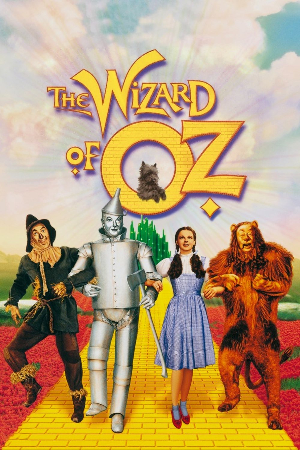
This classic starts in a dull, sepia-toned Kansas, reflecting Dorothy’s mundane life. When she lands in Oz, the screen explodes into vibrant Technicolor, showing a magical world full of wonder and danger.
The shift from black-and-white to color mirrors Dorothy’s journey from reality to fantasy. The bold hues of Munchkinland and the Emerald City make every moment feel alive, drawing us into her adventure.
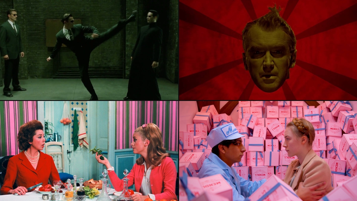
9. The Matrix (1999)
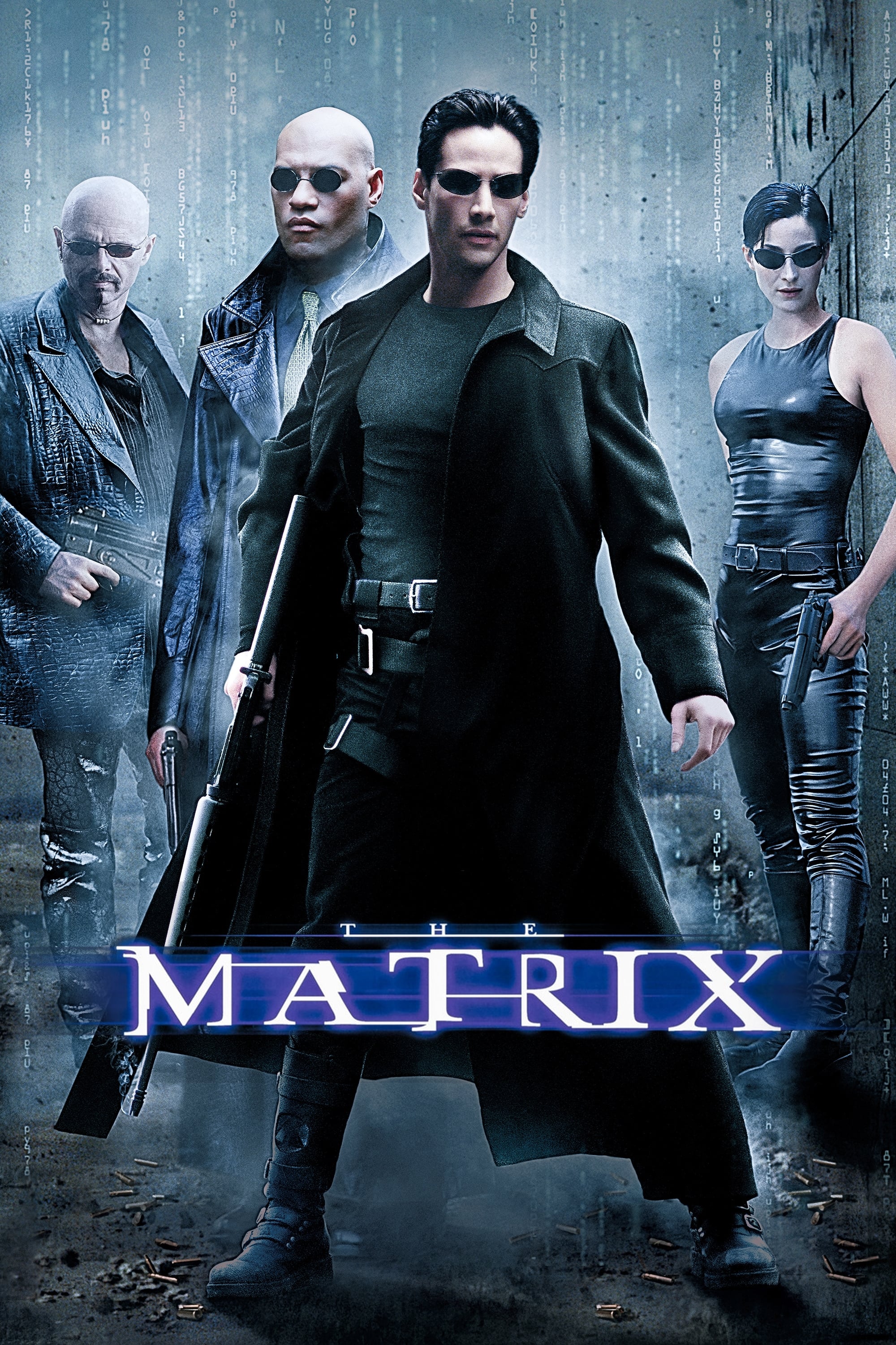
The Matrix uses a green-tinted palette inside its digital world, giving it an eerie, artificial feel. Outside, in the real world, muted blues and grays show a harsh, desolate reality.
This color contrast highlights the difference between illusion and truth. The sickly green underscores the control of the machines, while the bleak real-world tones emphasize Neo’s struggle for freedom.
8. Schindler’s List (1993)

Steven Spielberg’s film is mostly shot in stark black-and-white, reflecting the grim reality of the Holocaust. A red coat worn by a young girl stands out as a rare burst of color, symbolizing innocence amid horror.
The red coat draws our eyes, making her a focal point in chaotic scenes. It’s a heartbreaking reminder of hope and loss, showing how color can carry deep emotional weight.
7. In the Mood for Love (2000)
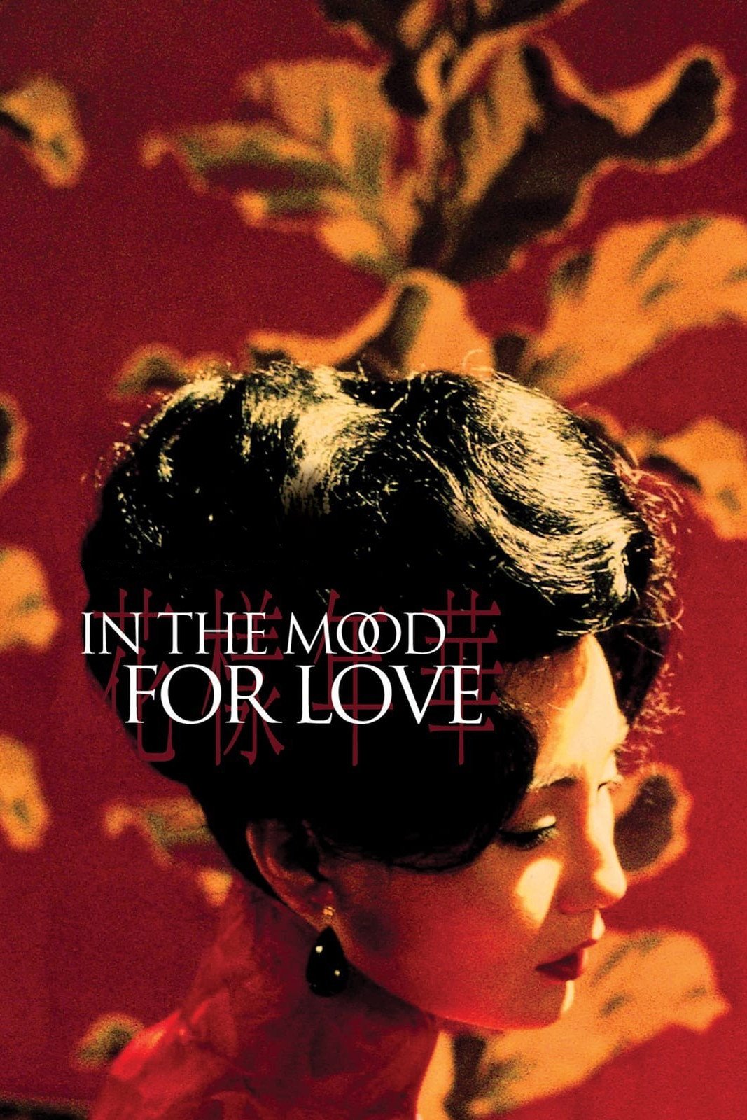
Wong Kar-wai’s film uses rich reds and greens to create a moody, intimate atmosphere in 1960s Hong Kong. These colors reflect the passion and restraint of two neighbors drawn to each other.
The warm lighting and bold hues make every frame feel like a painting. They show the characters’ unspoken desires, pulling us into their quiet, emotional story.
6. The Grand Budapest Hotel (2014)
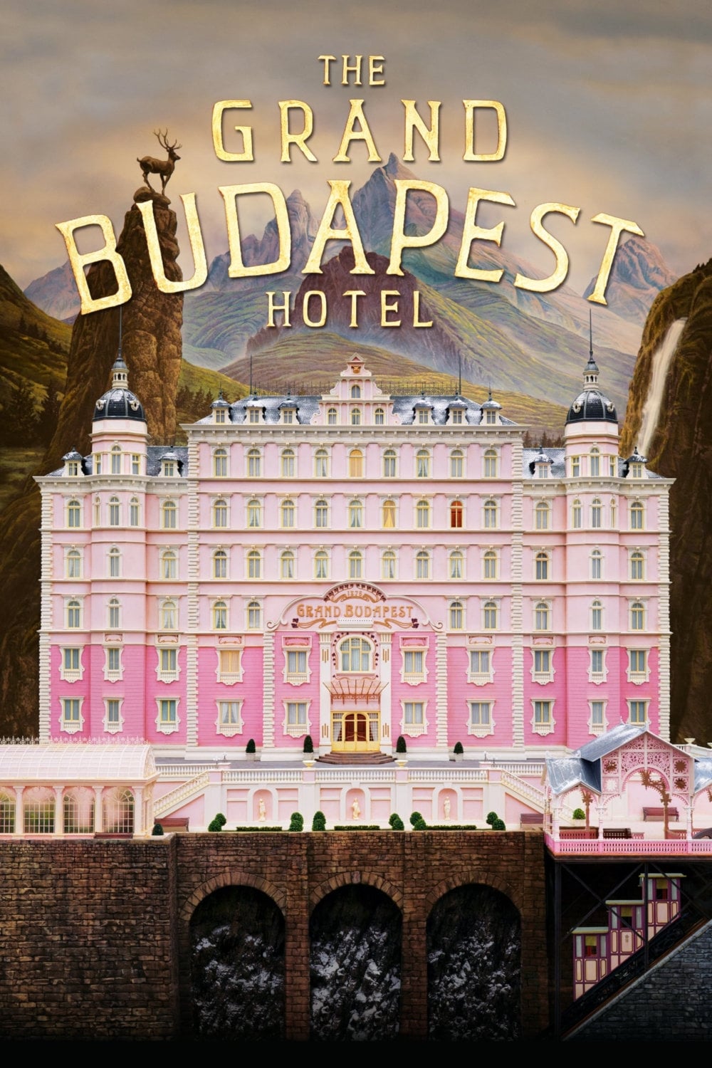
Wes Anderson’s film is a visual feast with pastel pinks and purples dominating the luxurious hotel setting. These colors create a whimsical, nostalgic tone that shifts with the story’s timeline.
As the plot moves from the 1930s to later decades, the palette changes to muted greens and oranges, showing the passage of time. This clever use of color makes the film’s world unforgettable.
5. Hero (2002)
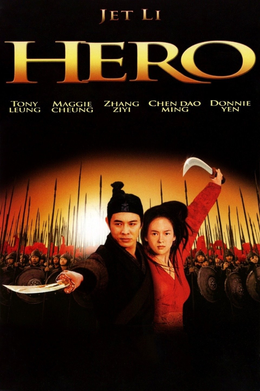
Zhang Yimou’s martial arts epic uses distinct color schemes for each version of its story. Red scenes pulse with passion, blue ones feel calm, and green ones suggest harmony.
These colors shape our understanding of the characters’ motives and truths. The bold visuals make every fight scene stunning while deepening the film’s themes of sacrifice and honor.
4. Moonlight (2016)
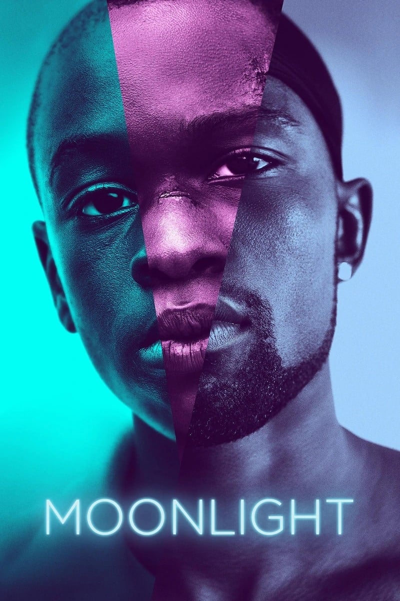
This coming-of-age story uses cool blues and purples to reflect Chiron’s emotional journey. The colors evoke sadness and introspection as he navigates his identity and struggles.
A key scene under moonlight ties the title to the blue tones, showing Chiron’s search for self. The palette makes his quiet moments powerful, pulling us into his world.
3. Vertigo (1958)
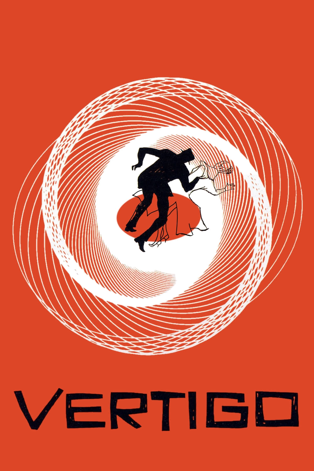
Alfred Hitchcock’s thriller uses red and green to show obsession and mystery. Red signals danger and desire, while green surrounds the enigmatic Madeleine, hinting at her ghostly presence.
The colors guide us through Scottie’s unraveling mind. A neon green glow in the climax makes the story feel haunting, tying the visuals to its themes of love and loss.
2. The Umbrellas of Cherbourg (1964)
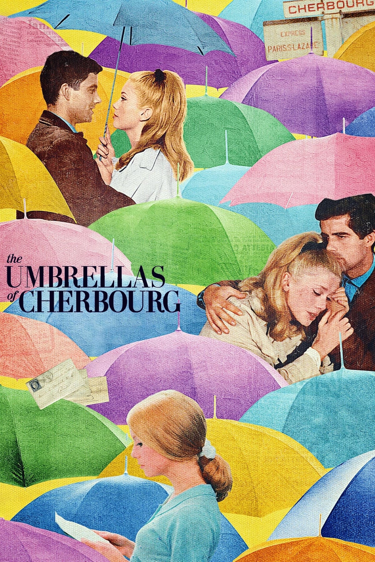
Jacques Demy’s musical bursts with pastel pinks, blues, and yellows, creating a dreamy, romantic vibe. The colors reflect the young lovers’ hope and heartbreak in a sung-through story.
As the plot shifts from joy to sorrow, the bright palette softens, showing their fading dreams. The vivid hues make every scene feel like a moving painting, full of emotion.
1. Cries and Whispers (1972)
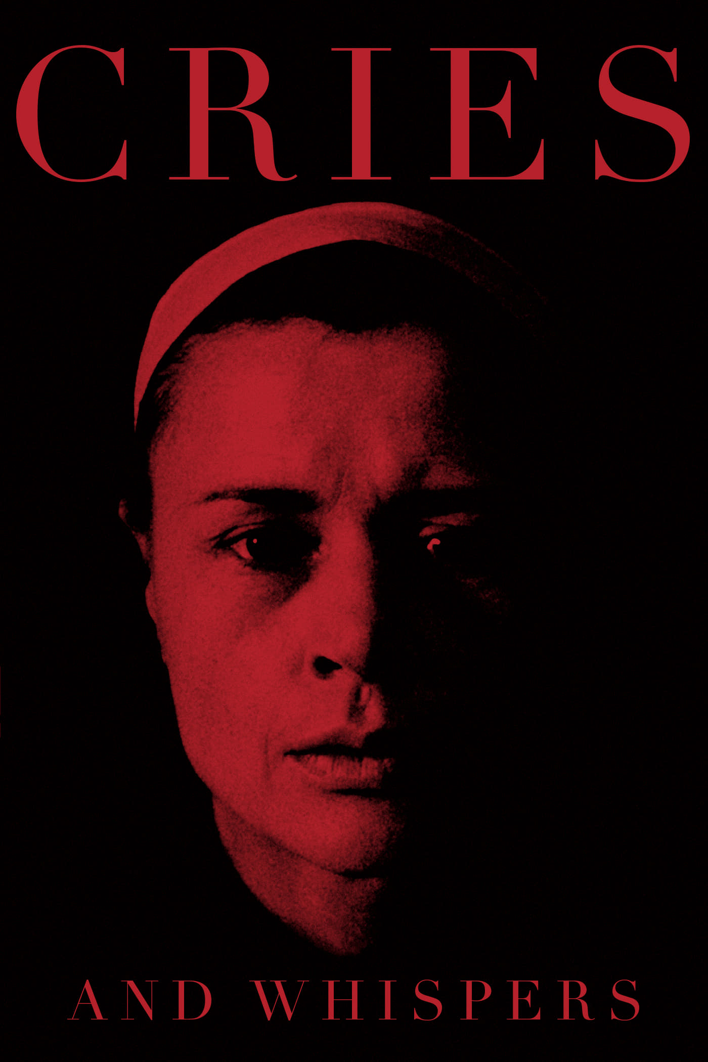
Ingmar Bergman’s film uses intense red to set a heavy, emotional tone. The crimson walls and fading transitions reflect the pain and passion of three sisters facing death and grief.
The bold color makes their inner turmoil feel real, almost suffocating. It’s a stark choice that turns the film into a deep, unforgettable exploration of human suffering.
Which movie’s use of color blew you away, or did we miss a gem? Drop your thoughts in the comments!