HBO’s ‘Harry Potter’ Just Gave Fans A Clearer Look At Its New Hogwarts Crest, And Not Everyone Is Sold
Rebooting one of the most beloved franchises in entertainment history was always going to invite scrutiny, and HBO’s Harry Potter series has spent the past year proving just how closely fans are watching every single detail.
From casting reveals to costume choices, nothing about this production has slipped by unnoticed, and the show’s visual identity has become one of the most debated aspects of the entire rollout.
That scrutiny reached a new level once the show’s first official teaser arrived earlier this year, giving fans their most substantial look yet at how different this adaptation intends to be from the beloved film series. Buried within that footage was a small but significant detail that immediately caught the attention of longtime fans paying close attention to the wizarding world’s visual language.
A clearer image of that detail has now started circulating online, giving fans an even better look at the new Hogwarts crest that will represent the school throughout the HBO series. Rather than the traditional coat of arms featuring a lion, an eagle, a badger, and a snake, the new emblem strips things down to a striking golden letter H, with roots stretching from its base and branches extending upward like a living tree.
The change first became noticeable in a brief flash of Hermione Granger’s robe during the show’s teaser trailer, where the golden tree emblem appeared set against a darker scarlet background rather than the bright, saturated colors fans associate with the eight film adaptations. That shift in tone has become something of a pattern throughout the marketing campaign, with the production consistently leaning into moodier visuals compared to the more vibrant aesthetic of the original movies.
According to Wizarding World, the franchise’s own official news hub, the new crest was intentionally designed as a simple, striking H rather than a traditional coat of arms, and it has been confirmed as the emblem representing Hogwarts itself throughout the series. The individual house crests reportedly remain intact with their traditional colors and mascots, meaning the overall shift appears focused specifically on how the school as a whole is visually represented.
Much of the speculation around this redesign has centered on what it signals about the show’s broader tone, especially for a series that has repeatedly emphasized its commitment to a more faithful, book-accurate adaptation than the films provided. A darker, more grounded visual identity would fit with reports that the production is leaning into practical effects and atmosphere rather than the flashy CGI spectacle audiences are used to from the earlier movie franchise.
That approach carries real risk given how deeply ingrained the classic Hogwarts crest has become in the franchise’s branding over more than two decades. Any deviation from something so recognizable was always going to generate discussion, and the reaction across fan communities has reflected exactly that kind of split reaction, with some embracing the fresh visual identity and others expressing hesitation about straying too far from what made the original imagery so iconic.
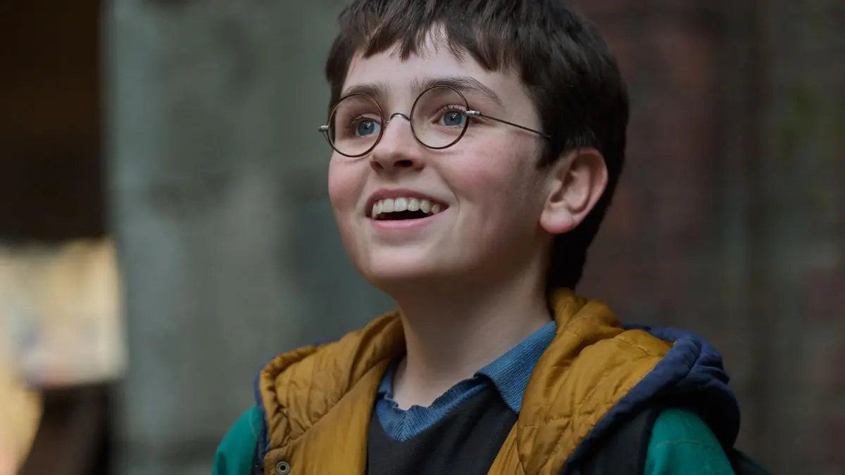
HBO’s Harry Potter series stars Dominic McLaughlin as the title character alongside Arabella Stanton as Hermione Granger and Alastair Stout as Ron Weasley, with the ensemble cast also including John Lithgow as Albus Dumbledore, Janet McTeer as Minerva McGonagall, Paapa Essiedu as Severus Snape, and Nick Frost as Rubeus Hagrid. The first season, officially titled Harry Potter and the Philosopher’s Stone, is set to premiere on HBO and HBO Max this Christmas.
With the show’s visual identity continuing to generate conversation well ahead of its debut, this new crest reveal is unlikely to be the last design choice fans dissect before the series finally arrives. Whether audiences ultimately embrace this darker, more understated take on Hogwarts branding may say a lot about how receptive fans will be to the show’s broader creative direction once episodes actually start rolling out.
Have something to add? Let us know in the comments!