Sony Gives Andrew Garfield’s ‘Amazing Spider-Man’ Films a Gorgeous New Look Makeover

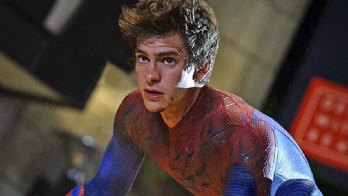

Sony Pictures has been on a nostalgia kick this week, methodically working through its entire Spider-Man catalog with a fresh coat of visual paint. After giving both Sam Raimi’s original trilogy and Tom Holland’s MCU films new artwork, the studio has now turned its attention to the often-overlooked middle chapter of the character’s cinematic history.
Andrew Garfield’s brief but memorable run as Peter Parker arrived in the gap between Tobey Maguire’s exit and Holland’s eventual arrival, offering a moodier, more romance-driven take on the character that still has a devoted following years later. Though the era only produced two films before Sony pivoted toward its deal with Marvel Studios, both movies left a distinct visual and tonal fingerprint on the franchise.
Sony Pictures has released new poster artwork for ‘The Amazing Spider-Man’ and ‘The Amazing Spider-Man 2’, part of a larger ten-poster series covering every live-action and animated Spider-Man film the studio has produced.
The redesigned ‘Amazing Spider-Man’ poster adopts a blue-toned color scheme, with Garfield’s Spider-Man looming large above Emma Stone’s Gwen Stacy and Rhys Ifans’ villain, the Lizard, both of whom anchored the film’s central conflict.

The sequel’s new artwork follows a similar formula while shifting its focus to the characters who defined ‘The Amazing Spider-Man 2’. That poster spotlights Garfield’s web-slinger going up against Jamie Foxx’s Electro and Dane DeHaan’s Green Goblin, the film’s dual antagonists whose competing storylines became a defining, if divisive, element of the sequel’s plot. Stone’s Gwen Stacy also returns prominently in the artwork, reflecting the character’s central role in the film’s emotional stakes.

Both posters maintain a consistent format with the rest of Sony’s newly unveiled collection, giving each era of Spider-Man’s film history its own distinct color identity while keeping a unified overall design language across the full set. That approach places Garfield’s blue-tinted duology alongside Raimi’s trilogy and Holland’s gold-toned MCU films as part of one cohesive visual celebration of the character’s twenty-plus year run on screen.
This release is one piece of a broader unveiling that also includes new artwork for the animated ‘Spider-Man: Into the Spider-Verse’, which received its own purple-accented poster spotlighting Miles Morales, Gwen Stacy, Peter B. Parker, and the Prowler. Altogether, the ten-poster series spans every corner of Sony’s Spider-Man output, offering fans a rare side-by-side comparison of how the character’s on-screen identity has shifted across multiple actors, directors, and creative eras.
The timing of this retrospective lines up with ‘Spider-Man: Brand New Day’ continuing to dominate at the box office, giving Sony a natural moment to spotlight the character’s full cinematic legacy while public interest remains at its peak. It also arrives as renewed attention has turned toward the franchise’s earlier chapters more broadly, with Raimi’s original trilogy having separately returned to theaters last fall through a limited Fathom Entertainment release.
Garfield’s two-film run remains one of the more debated chapters in Spider-Man’s cinematic history, praised by many for its chemistry between Garfield and Stone but criticized by others for the sequel’s overstuffed villain roster. Seeing both films get this kind of dedicated visual treatment alongside the rest of the franchise suggests Sony isn’t interested in downplaying that era, even as Holland’s version continues rewriting the character’s box office records.
Which Andrew Garfield Spider-Man poster design is your favorite?
Have something to add? Let us know in the comments!