All Batman Symbols Ranked by Awesomeness
Countless Batman symbols have been introduced over the years, either to strike fear in the hearts of criminals or to modernize releases and merchandise. The Batman symbol is one of the most iconic and recognizable symbols of all time, becoming increasingly infamous as the Batman franchise grew.
The symbol has seen numerous adaptations over the course of many decades, but some are still more popular than others. Stick around to find out everything there is to know about how the symbol was developed, topped off with a list of the best Batman symbols ranked according to their awesomeness.
Batman Symbol: History & Timeline
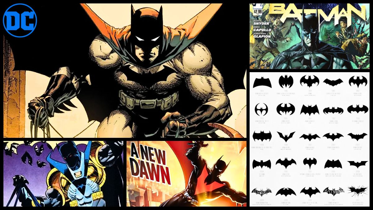
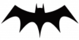
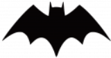
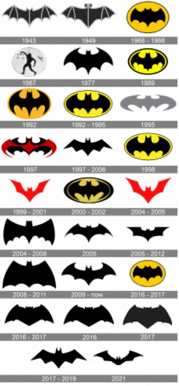
The Bat-Insignia, also known as the Batman Symbol or Emblem, has been redesigned numerous times to accompany the various iterations of Batman. At the time of writing, there are at least around 80 different Batman symbols, excluding variants or redesigns of the same Batman insignia.
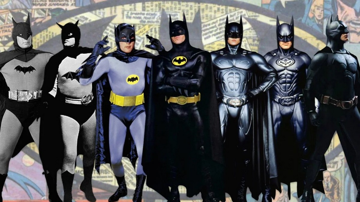
Adaptations to the Batman symbol are generally accompanied by modifications to his suit as well. Still, it has kept the distinct shape of a bat stylized with its wings open and has been finished off with Batman’s pointed ears for the most part.
Below is a summarized overview of the most notable changes to the Batman symbol over the past few decades.
| Batman Symbol | Timeframe | Description |
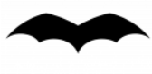 | 1939 | The first version of the Batman emblem only featured wings with rounded curves and five wing points. |
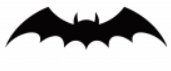 | 1939 – 1941 | This version was at least twice as big as the original, featuring a prominent head and larger wings with 7 points. The emblem featured blue details on the wings, although not always visible. |
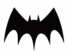 | 1941 – 1944 | This version featured a gothic style, with long and sharp wing points and a less prominent head. |
 | 1944 – 1946 | This emblem was wider than its predecessors, with shorter wing points and sharper ears. |
 | 1946 – 1950 | This Batman symbol was more similar to the original, now longer and sharper, featuring less angular wing points and a more prominent head. |
 | 1950 – 1956 | This symbol brought a strong curve at the top of the design. Many believe this was done for the symbol to occupy more space on Batman’s chest. |
 | 1956 – 1958 | This symbol became more compact and triangular, replacing the former curve with sharp edges. |
 | 1958 – 1960 | This symbol became slimmer, with longer wing points and a thinner head section. |
 | 1960 – 1964 | This Batman symbol was nearly identical to the one seen in the 1950s, with the exception of a slimmer and more prominent head section. |
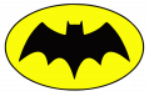 | 1964 – 1966 | The symbol didn’t see much change apart from the wing curve, but it was positioned inside a yellow ellipse with a black outline. Some believe this was done to make the symbol stand out better, while others believe it was done to start a new era for the Batman saga. |
 | 1966 – 2000 | The creators took things further by fully embracing the yellow oval and outline, altering the bat symbol’s wings to complement the shape better. |
 | 2000 – 2011 | The yellow oval was removed while the symbol’s shape resembled versions seen in the 1940s and 1950s, with the exception of a wider, slimmer design and curved ‘claws’ at the top of the wings. |
 | 2011 – 2016 | This Batman symbol has a longer tail with elevated wings, and there are also no ‘claws’ on their ends. |
 | 2016 – 2018 | This Batman symbol is slim and flat, with less intense curves and straighter lines. The entire symbol is outlined with yellow-orange. |
 | 2018 – Present | The most recent Batman symbol is nearly identical to the version seen between 2000 and 2011. |
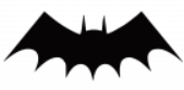
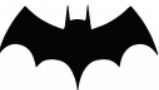
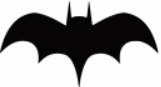
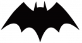
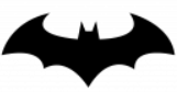
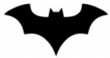
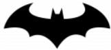
Many other Batman symbols have gained popularity over time, including those that merge with the symbols of other iconic superheroes as well as the symbols seen with DCAMU movies and on-screen releases. More examples of the most well-received Batman symbols across titles can be seen below, thanks to 1000 Logos.
The symbol is featured in almost every aspect of Batman’s expensive gear and gadgets, such as the chest emblem on the Batsuit, the Bat Signal, and the shape of his Batarangs. New variants of the Batman symbol are often created with new releases as well, making the list of Batman insignias endless in the long run.
10 Best Batman Symbols Ranked
The Batman symbols depicted above have inspired the creation of many others. Countless new variants have been created over the years, as seen below (minus the many color variants), thanks to fans on Reddit.
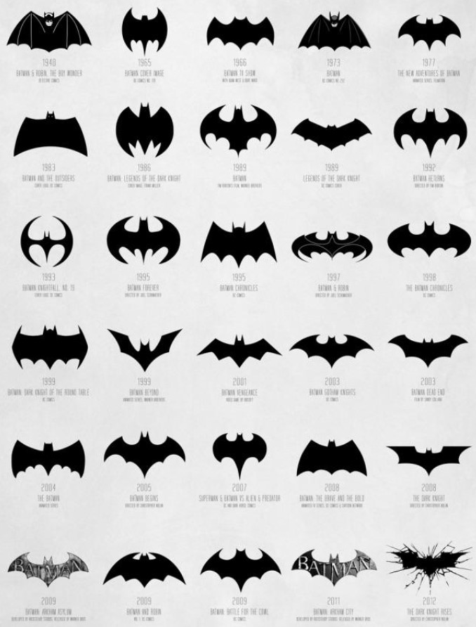
Despite the use of each artist’s creativity, there is a correlation between the Batman symbols seen in numerous titles and the design of the original symbols. Similar shapes and details are incorporated into modern Batman symbols, reinvented with numerous colors, and topped off with styling that fits the Batman title in question.
It’s hard to pin down a ‘best’ Batman symbol due to the conflicting opinions of countless fans, and the ranking is always up for debate. The list below includes the best Batman symbols ranked according to their popularity and appearance – not necessarily the popularity of the relative Batman issue or title.
10. Knightfall (1993)
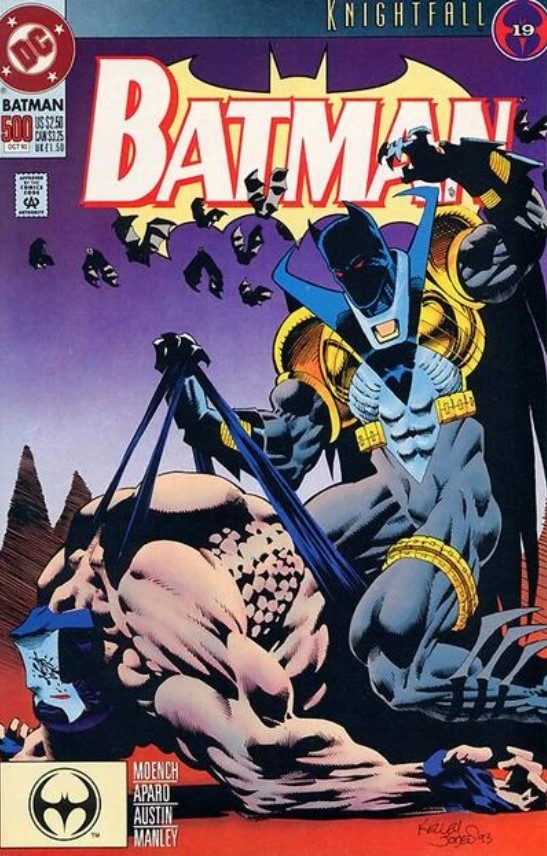
Batman’s symbol and getup were iconic in Knightfall, making its debut in 1993 with shiny metallic armor and more futuristic trimmings. Although this look hasn’t aged too well, the circular yet sharp logo is still tasteful, and it would later be used as inspiration for the insignia used in Batman Ninja.
9. Hush Batman (2002)
The Batman symbol featured with Hush is one of the most popular to date, reminiscent of the original symbols created between 2000 and 2016. Its simple yet tasteful design makes it a top choice for Batman merchandise as well as tattoos.
8. The Dark Knight Rises (2012)
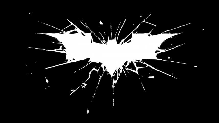
Batman’s insignia was unique and loveable in The Dark Knight Rises (DKR), following the streamlined silhouette of symbols seen between 2005 and 2012. What sets this design apart is the shatter-like detail surrounding the symbol, allowing room for some awesome effects and designs in posters, merchandise, and tattoos.
7. Batman Rebirth (2016)

While the title’s logo resembled the symbol seen between 2000 and 2016, the insignia that Batman flaunts was only used between 2016 and 2018. This symbol is flatter and more angular, with less curvature as a whole, and has been finished off with a yellow-orange outline along its edges.
6. Batman Beyond (1999)
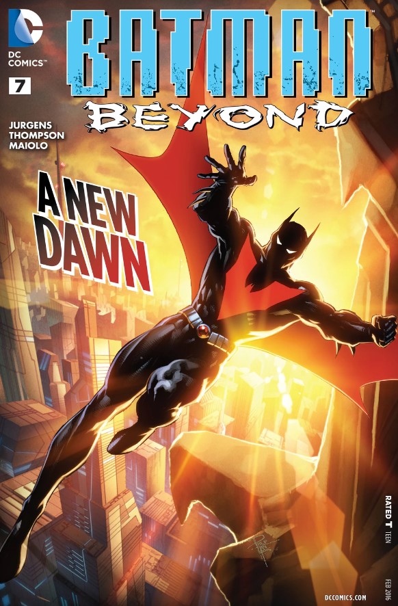
The symbol seen in Batman Beyond is unique compared to many others, accompanied by a whole new look for Batman. The design debuted in 1999, after which it saw adaptations in size up until 2004, and it’s notable for its bright red shade and the extended shape of its wings.
5. Batman Returns (1992)
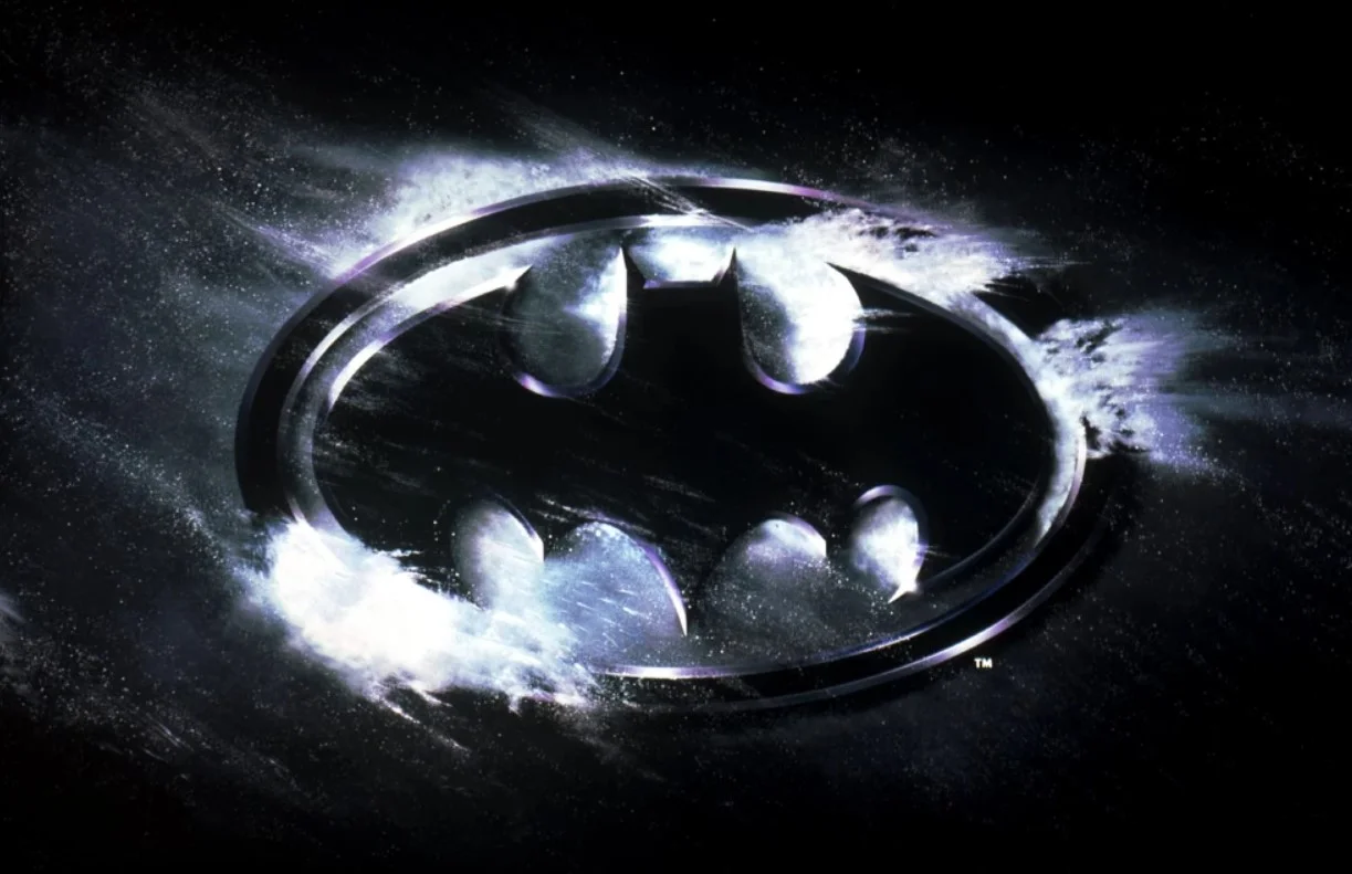
The symbol seen in Batman Returns is nearly identical to the most notable Batman logo encompassed by a yellow oval, with the most similar adaptations being created between 1992 and 1998. The main difference with this symbol was its lack of color and metallic finish.
4. The Dark Knight (2008)
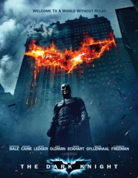
Batman’s insignia in The Dark Knight (TDK) is loved by many fans, following on from the same streamlined logo seen between 2005 and 2012. Batman wears the basic logo on his chest, while a blue glow of light surrounds this symbol on merchandise and posters.
3. New 52 Batman Sigil (2011)
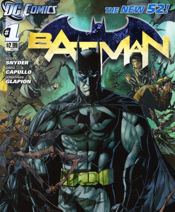
Many fans love the symbol that Batman wears in the New 52 saga. It follows a clean, classic, and simple design that’s reminiscent of many original designs.
2. Arkham/Injustice Batman (2009)
Batman’s symbol was classic in the Arkham saga, as well as in the Injustice video game series. It followed the same design seen between 2000 and 2016, adapted with the use of a grey textured print that resembles the worn-down concrete seen throughout Gotham City.
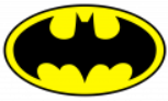
1. Batman 89′ (All Variants)
Making it to the top spot as the best Batman symbol of all time is the infamous black and yellow design initially seen in 1989 and its modernized variants. The original symbol is identified by its yellow ellipse and black outline, as well as additional tail points and strong curves.
While Batman logos of the 1940s were created by Jerry Robinson, the original black and yellow Batman symbol was created by Anton Furst. It was adapted between 1992 and 1998, removing the extra tail points while extending the tail to achieve a balanced aesthetic.
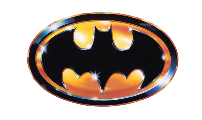
Bill Garland created the iconic Gold Batman 89′ insignia used in the 1989 Batman movie poster, although the original 89′ symbol was still used for Batman’s gear. Variants of the Batman 89′ symbol are still the most recognized, even among those who aren’t familiar with DC titles and characters.
For a quick look at some of the other most popular Batman symbols out there, check out the video below by Mint-Hunter Comics.
That’s everything there is to know about all of the Batman symbols as well as the most popular variants, with stats thanks to the Batman Wiki, DC Database, and 1000 Logos. This symbol has changed quite a lot since the Caped Crusader’s initial debut, now representing decades’ worth of Batman’s crime-fighting and adventures.
What do you think about all of the best Batman symbols and how they developed? What’s your favorite Batman symbol of all time? Let us know in the comments below!